Getting started
Finding your way around
Yappie draws its own title bar, and everything else lives behind one menu — here's the whole map.
Yappie's desktop window doesn't look like most apps, because it draws its own title bar instead of borrowing the operating system's. Once you know where the two or three permanent things live, the rest of the app is one menu deep. This page is the map.
The top strip
The strip across the very top of the window is Yappie's title bar. On the left is the Menu button, the three-bar hamburger that opens everything. The empty middle is the drag handle: grab it to move the window, double-click it to maximize, or shove it at a screen edge to snap.
On the right sit two app buttons and, on Windows and Linux, the minimize, maximize and close controls; on macOS the native traffic lights tuck into the same strip instead. The first button is minimalist mode, which hides the pet and blows the countdown ring up so the window is nothing but a timer. The second, ⤢, pops Yappie out as a small floating companion that sits over your other windows. Both act on the main view, so they step aside while a menu page is open.
Your pet's row
Directly under the strip are three rows that belong to the pet rather than the window.
- The name, which opens Pet customization, followed by the current tier and rank in brackets, which opens Journey. A small dot appears beside them when you're signed in with sync on: green means this device is the active one, amber means another device is.
- A pill reading something like "1h 20m focused · 4 done", with a slim energy bar along its bottom edge. It opens Growth.
- The Focus / Today / Tomorrow tab pills. Pages slide in from the side you moved toward.
On a day you've declared off, this whole block is hidden and the Focus screen goes calm.
The Menu
Everything else in Yappie lives behind the hamburger. It holds nineteen destinations in seven groups, divided by thin lines:
- Focus now, Today's tasks, Tomorrow's tasks: jumps to those three tabs.
- Projects, Tags, Recurring tasks, History: the things tasks belong to.
- Growth, My sky, Charts, Hall of Glory: how you're doing.
- Time off, on its own.
- Friends, Study groups, Notifications.
- Pet customization, Soundscapes, Backgrounds.
- Settings.
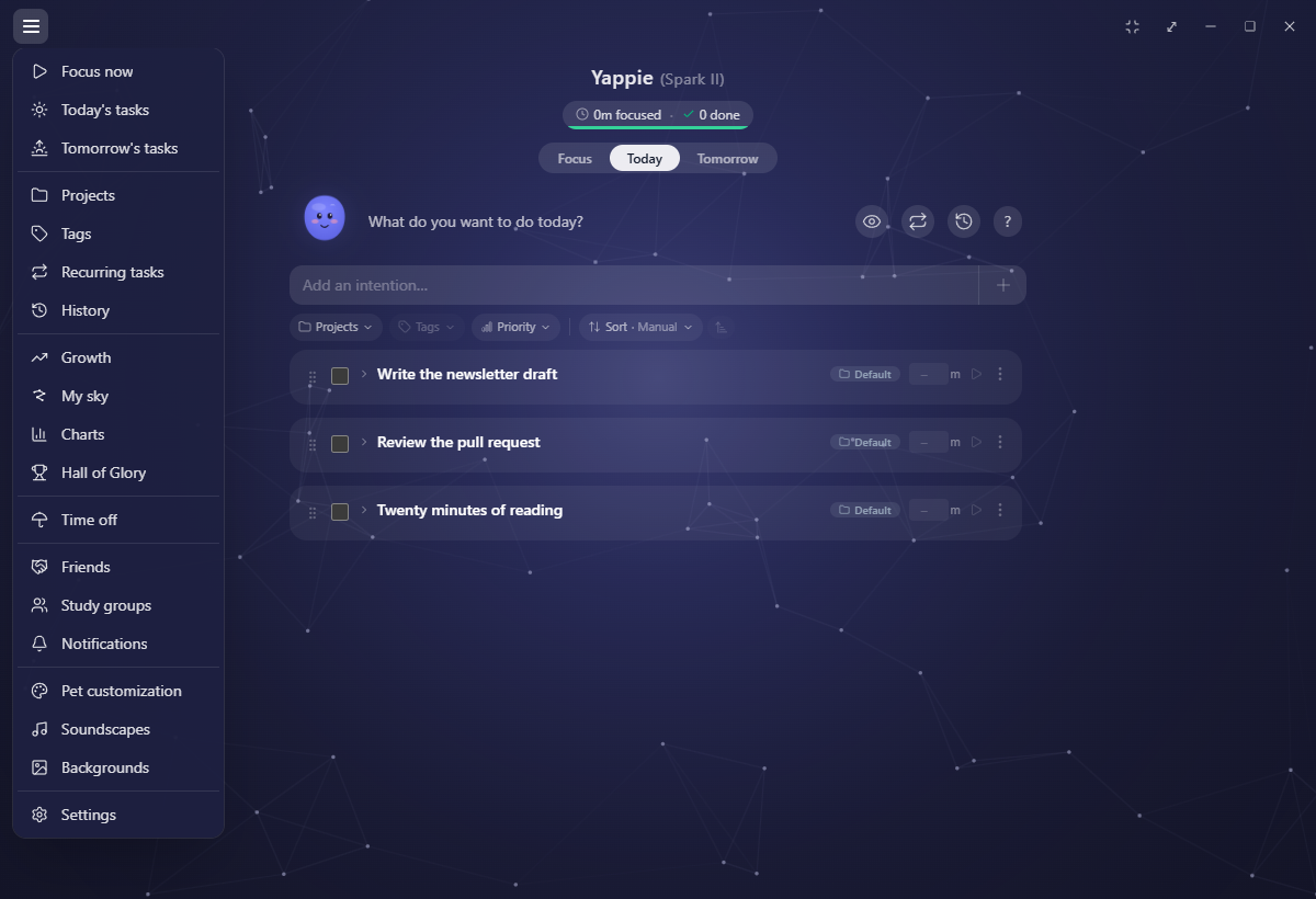
Two entries carry counts. Study groups shows how many of your groups have a focus room running right now. Notifications shows unseen cheers, friend requests, unread notifications and pending group invites added together. When either has something waiting, a small red dot appears on the hamburger itself, so you can tell without opening it.
Click to open, click outside or press Esc to close. On a rest day Today's tasks greys out, and Tomorrow's tasks does the same when tomorrow is off too. Until you've finished setup, the hamburger isn't there at all.
One chevron goes back
Every page opened from the menu behaves the same way. It slides in from the right and folds back out the same way. There is no ✕ anywhere, and no second hamburger inside a page. Instead there's a single ‹ chevron immediately left of the page title, and it does whatever "back" means where you are: out of a project's detail view to the project list, or out of the page entirely.
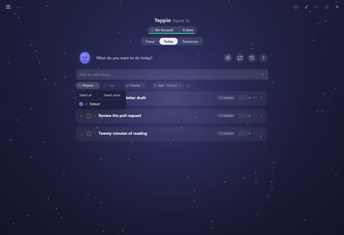
On long pages the header slides away as you scroll down and comes back the moment you scroll up.
Right-click is back
Anywhere in the app, right-clicking steps back one layer: it closes the topmost dialog, then a detail view, then the page. It works on the little pickers too, the colour, priority, alarm and time wheels included.
If you're ever lost, right-click. Inside a text box, or on text you've selected, right-click still gives you the usual copy and paste menu.
Dialogs, for their part, grow out of the thing you clicked and fold back into it when they close, so it stays obvious what a dialog belongs to.
The bottom of the window
Up to three bars take turns along the bottom, and they're real rows rather than floating overlays, so the page above them shrinks instead of hiding underneath.
- The focus banner, whenever a session is running and you're looking at something else. It carries the live countdown, what you're focusing on, and pause and stop; clicking it jumps back to Focus.
- The soundtrack player, whenever a track is loaded.
- The waiting bar, while you're queued to focus with a stranger.
Separately, on the Focus tab there's a slim handle flush to the bottom: that's the drawer for logging a break, some movement, time with people, or a day off.
Things that come to you
Yappie never throws a full-screen interruption at you. Badges, sky discoveries, level-ups and tier-ups, the once-a-day look back at yesterday and the occasional short survey all roll up as a drawer from the bottom of whatever page you're on, one at a time, never stacked, and never over a running focus session.
Help, in place
The first time you open Yappie, a short tour dims the window and points at one thing at a time, working through the Focus tab and its controls, the log drawer, Today, Tomorrow, the growth pill, the pop-out and the Menu.
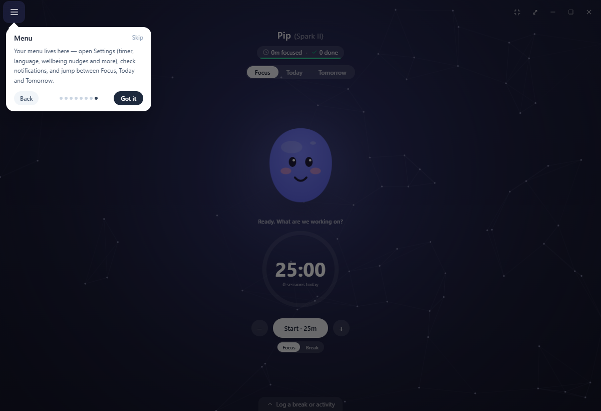
Most of the bigger pages then have their own walkthrough on your first visit, and Today, Projects, Tags, Recurring tasks, History, Growth, My sky and Time off each keep a permanent ? beside the title that reads the same material back to you later. Those "seen" marks are per device, so a fresh install shows them again.
Outside the window
The tray icon is your actual pet, in your colours, and it restyles the moment you do. Hover it for the live countdown; right-click it for start, pause, stop, pop out, show Yappie, a start-with-your-computer checkbox and quit. On a rest day those collapse to a single Actually, I want to work. Closing the window tucks Yappie into the tray when that setting is on, and quitting during a focus session always asks first.
Next, see A day with Yappie for all of this in motion, and Desktop tips & hidden gems for the gestures hiding inside this layout.
Last updated October 21, 2026